10,000 search results
(0.063 seconds)
- Stage Play JNL by Jeff Levine,
$29.00 Vintage sheet music for Earl Carroll's dramatic mystery-comedy production "Murder at the Vanities" has its title hand-lettered in the Art Deco style which served as the basis for Stage Play JNL.
 - Raqilla Kids by Zamjump,
$15.00 Introducing Raqilla Kids - Playful Display Font Raqilla Kids is a display font with a cute character. This is a kids themed font look, inspired by children's writing in general, with a shape that looks irregular but is very distinctive, these characters will add a warm touch to any look. Add this beautiful display font to your every creative idea and see how it makes them stand out! FEATURES - Uppercase - Lowercase - Numbering - Punctuations - Ligature - Alternate - Swash - Multilingual Support - Works on PC or Mac - Simple Installation - Support Adobe Illustrator, Adobe Photoshop, Corel Draw, also works on Microsoft Word Thanks
 - Biwa by Wordshape,
$20.00 Biwa is a new straight-sided family of formally nuanced grotesk typefaces. Biwa’s lighter weights feel subdued, cool in tone, and neutral, while the heavier weights are more robust and full of personality. Developed over the past few years by Ian Lynam and James Todd, the 14-member Biwa family and the accompanying 14-member Biwa Display family are paeans to the immediate moment when phototype arrived on the global scene — partially smooth and partially machined. Biwa and Biwa Display are neutral in tone, have enlarged x-heights, and look amazing on-screen and in print. Each weight is designed to be highly readable in print and on-screen. The italic variations are true italics, having a single-storied italic a and have been designed for smooth, fluid reading and text-setting. Lovingly spaced and kerned, the Biwa family works equally well for text typesetting and for display design work. Languages supported include Western European, Central, and South European as well as Vietnamese. The entire family is comprised of a range of weights and a matching display family that features rounded terminals for large-scale display work. An agate version of Biwa Black is provided for free.
 - Victorian Ornaments by Gerald Gallo,
$20.00 Victorian Ornaments was inspired by the decorative borders and panels produced during the Victorian era. There is an assortment of 47 ornaments all located under the character set keys.
 - Malden Sans by Monotype,
$49.00 Malden Sans is a mischievous grotesque sans serif with charming details that gives designers a solid typographic voice. It was created by Michele Patanè with regular and condensed widths, as a utilitarian typeface family for print and digital environments. It was originally designed as part of a type system for cinema magazines, and embodies the devil-may care attitude of the silver screen. Designer Michele Patanè looked back to an earlier era of typography to create the typeface, embracing unusual details, rather than ironing them out. “There is a very naive way of using typography in the 30s and 40s, something not as clean as how it’s used in the late 50s and 60s when everything passed through a rationalisation of the typographic palette,” he explains. “In film magazines you can still see a bit of roughness, and I like that.” This is a design that’s desperate to be used in editorial environments, and has been created to stand up to lower quality paper. It would be equally at home on posters, packaging, and even in digital environments where designers are looking for something more expressive than another geometric sans serif. Malden Sans includes a Normal and Condensed range, with 7 weights in the normal and 6 in the Condensed, both including italics.
 - Nephrite by Nine Font,
$29.00 Nephrite is a clean and soft family of 14 styles, 7 weights and italics. Recommended for text, magazine, book, logo and brandings.
 - Utusi Star - Unknown license

- CMSquish - 100% free

- Sri Kandi by Arendxstudio,
$20.00 Sri Kandi is a stylish and effortlessly cool handwritten font with a contemporary twist. It will add a unique spin on any design project! You will find font in OTF formats. No special software is required to use Sri Kandi, just install it as you normally do on your system. Includes: - Uppercase - Lowercase - Numerals - Punctuation - Symbols - Ligatures - Alternates - Multi-language Characters
 - Gothic Tuscan One by HiH,
$12.00 Gothic Tuscan One is a all-cap condensed gothic with round terminals and decorative “tuscan” center spurs. It was first shown by William H. Page of Norwich, Connecticut among his wood type specimen pages of 1859. Gothic Tuscan One exemplifies the strength of decorative wood types: large, simple type forms that provide the visual boldness sought by advertisers of the Victorian period. While our marketing has gotten so very sophisticated, there is always a place for simple, visually strong typeface. Although about 14 miles inland, Norwich lies at the head of the Thames River. The river is both wide and deep, and therefore was not bridged in the early 20th century. From the 17th century until then, if you wanted to get from Groton on the west bank to the whaling port of New London on the east bank by land, you had to had to go by way of Norwich. Because of its size, the Thames is navigable all the way from Norwich to New London. Docks were built in Norwich around 1685 and the city became Connecticut’s 2nd largest port by 1800. With the construction of the Norwich & Worcester Railroad in 1835, Page could easily ship his wood type north by rail or south by coastal schooner. Included with our font, Gothic Tuscan One, are two 19th century printer’s ornaments of sailing ships similar to those that sailed up the Thames to Norwich. There is also a more contemporary glyph of a whale, looking quite pleased that the only whaling ship left in Connecticut is the Charles W. Morgan, permanently moored at Mystic Seaport. Reference: Moon’s Handbooks, Connecticut 2nd Edition (Emeryville CA 2004). Gothic Tuscan One ML represents a major extension of the original release, with the following changes: 1. Added glyphs for the 1250 Central Europe, the 1252 Turkish and the 1257 Baltic Code Pages. Added glyphs to complete standard 1252 Western Europe Code Page. Special glyphs relocated and assigned Unicode codepoints, some in Private Use area. Total of 332 glyphs. 2. Added OpenType GSUB layout features: pnum, ornm and dlig. 3. Added 330 kerning pairs. 4. Revised vertical metrics for improved cross-platform line spacing. 5. Redesigned mathamatical operators 6. Included of both tabular (std) & proportional numbers (optional). 7. Refined various glyph outlines. Please note that some older applications may only be able to access the Western Europe character set (approximately 221 glyphs). The zip package includes two versions of the font at no extra charge. There is an OTF version which is in Open PS (Post Script Type 1) format and a TTF version which is in Open TT (True Type)format. Use whichever works best for your applications.
 - Blaue Brush by Beige Type,
$29.00 Blaue Brush is a handmade typeface painted with a Japanese brush marker on smooth paper. While the font was digitalised, special care was taken to retain its handmade character; as a result it is rough and authentic. Blaue Brush offers a complete font set in one weight that can be used in many languages, with uppercase, lowercase and a full range of decorative characters – a set of five decorative borders, arrow segments and many image characters. Blaue Brush is suited for use in packaging design for labels, tags, posters, unique occasions, music band styles and whatever else. Embrace the brush!
 - HVD Edding 780 - Unknown license

- Oceantide Display by Elyas Beria,
$12.00 Oceantide Display is a whimsical and highly stylized nautical-themed font suitable for display use. The main focus is on standard English capital letters, with a few stylistic alternatives included. Lower case letters, numbers, and some symbols are included but are limited and there are a few limited international letters.
 - Utopian by Sudtipos,
$39.00 UTOPIAN is a color font family based on primary colors and pure geometric shapes, influenced by Bauhaus, DeStijl and Art Deco. Its pure shapes and basic colors are inspired by the beauty of simplicity of modular order and grid, creating a perfect environment where all these elements live in a perfect color harmony. In the other hand, DYSTOPIAN, the black and white family, represents a close sibling in appearance and structure, that carries an opposite meaning, with a darker look and feel. Both typefaces are, somehow, a reflection of the divided views and posible outcomes that the future times ahead yield before us. Package: Utopian/Dystopian comes in file with a pre-defined color palette. You can always change the colors converting the text to outlines. Technical info to use: The package contains a normal TTF/OTF set of fonts in Black and White and a colorfont in SVG-TTF format. To be able to use the color file you need to have installed Adobe Photoshop CC2017 or Adobe Illustrator CC2018. Not all the browsers support color fonts so please be sure to use them as graphics.
 - Print Shop Cuts JNL by Jeff Levine,
$29.00 Once again, another eclectic mix of vintage cartoons, ad cuts, sales builders, dingbats, borders and embellishments come together in Print Shop Cuts JNL. These charming images add that touch of "retro" to any digital or print project.
 - Crumpled Parchment by Celebrity Fontz,
$19.99This original typeface appears to be lifted straight from an old crumpled piece of parchment or from a pirate map. An absolute must-have for Halloween, children's publications, pirate-themed texts, and any writing that needs to convey a haunting feel. These tattered letters conjure up spirits and spooks of buccaneers, swashbucklers, and conquistadores from centuries past. - Desirable Brust Texture by Alcode,
$20.00 Desirable Brush Texture is a brush version of desirable solid released in 2019. With a classic style and an elegant touch, inspired by Italian women's handwriting and ancient manuscripts. These two fonts are carefully designed to work together in harmony making them perfect for wedding media, book covers, greeting cards, logos, branding, business cards and certificates, even for any design work that requires classic, formal or extravagant. Try Desirable Brush Texture, enjoy the richness of the features and let her fun and elegant excitement make you happy and enhance your creativity! You can use this font very easily. Multilingual Support And Special Ligatures If you are interested in the solid version, visit the link - https://www.myfonts.com/fonts/alcode/desirable-calligraphy/
 - Third Reign by Mans Greback,
$59.00 Third Reign is a decorative medieval typeface. With braids and pearls, this swirly typeface of extreme variability brings us to the golden times of epic knight sagas. Third Reign is the typeface of a Middle Age queen or a viking ruler. Use it for a Middle Ages game, a fantasy headline, or as a logotype for anything of historical theme. With usage in any modern software, the letters will automatically overlap and embrace in an elegant way. To make heraldic symbols, copy these icons: 🐉 🐎 👑 🗡 🦁 🦅 🦌 + ♖ × ✝ ⚓ * ⚔ † ‡ Alternatively write %A %B %C ... etc to create the heraldry. (Download required.) Dragon, Horse, Crown, Sword, Eagle, Deer, Cross, Anchor are some of the logos. Use [ ] for side borders. Example: [Magic⚔Thrones] The Third Reign font family consists of two styles: The decorative Border style, and the plain Regular style. The font is built with advanced OpenType functionality and has a guaranteed top-notch quality, containing stylistic and contextual alternates, ligatures and more features; all to give you full control and customizability. It has extensive lingual support, covering Greek and Cyrillic, as well as all Latin-based languages, from North Europe to South Africa, from America to South-East Asia. It contains all characters and symbols you'll ever need, including all punctuation and numbers.
 - TG Minagi Sans by Tegami Type,
$30.00TG Minagi Sans is a neo-humanist sans serif that takes inspiration from some calligraphy and blackletter letterforms providing sharp details and a little stiffness in some parts of the typeface. By combining these things with the modern form of the sans serif letter, TG Minagi Sans has a forceful and distinct character. Super terrific when used at massive sizes for display purposes and headlines, but reliable enough for small text sizes. TG Minagi Sans comes with 7 weights, 2 axes & 14 Styles, including a variable font file. Has several OpenType features such as various ligatures, lining figures (proportional, old styles, superior, inferior, denominator, numerator & fraction), stylistic styles 01-04 & covered more than 100 languages Latin based. - We Pray - Unknown license

- The Riskeys by Letterhend,
$19.00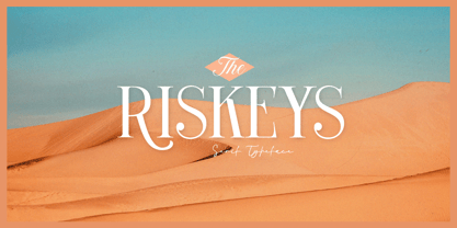 The Riskeys is a stylish and sophisticated modern serif font. This typeface has can be used for modern theme or vintage looks with ligatures & alternates. Very suitable for logo, headline, tittle, and the other various formal forms such as invitations, labels, logos, magazines, books, greeting / wedding cards, packaging, fashion, make up, stationery, novels, labels or any type of advertising purpose. Features : uppercase and lowercase numbers and punctuation multilingual ligatures alternates PUA encoded We highly recommend using a program that supports OpenType features and Glyphs panels like many of Adobe apps and Corel Draw, so you can see and access all Glyph variations.
 - F2F Mekanik Amente by Linotype,
$29.99The Face2Face (F2F) series was inspired by the techno sound of the mid-1990s, personal computers and new font creation software. For years, Alessio Leonardi and his friends formed a unique type design collective, which churned out a substantial amount of fresh, new fonts, none of which complied with the traditional rules of typography. Many of these typefaces were used to create layouts for the leading German techno magazine of the 1990s, Frontpage. Leonardi and his fellows would even set in type at 6 points, in order to make it nearly unreadable. It was a pleasure for the kids to read and decrypt these messages! F2F Mekanik Amente appears as if it had once been a normal font whose letters were horribly attacked by a pair of scissors. This font could be a very creative choice for headlines. F2F Mekanik Amente is one of 41 Face2Face fonts included in the Take Type 5 collection from Linotype GmbH. Leonardi designed 11 of these himself." - Handyrush by Zamjump,
$19.00 Introducing Handyrush Script font. It was inspired by retro typography designs in the 80's. There are over 250 glyphs in this font including Multilanguage Support. The OpenType feature with Stylistic Alternate to replace letters in the middle and end with a swash, and there are 3 swashes, and to display stylistic alternates it's quite easy just by typing characters+underscor / underscor+characters. specially for swash just type underscore underscore + a / b / c. Handyrush Script is very suitable for application especially on logos, and various other formal forms such as invitations, labels, logos, magazines, books, greeting / wedding cards, packaging, fashion, make up, stationery, novels, labels or all types of advertising purposes .
 - Allarmante by Letterhend,
$15.00 Inspired by Halloween theme. The authentic fontto give you fun and playful feel but scary vibes too. This font perfectly made to be applied especially in logo, and the other various formal forms such as invitations, labels, logos, magazines, books, packaging, stationery, novels, labels or any type of advertising purpose. Features : uppercase & lowercase numbers and punctuation multilingual PUA encoded
 - MBF Inno by Moonbandit,
$17.00 Inno font, is a modern take on the futuristic scifi theme, this typeface is clean, sharp, and have plenty of alternative, you can easily access them through uppercase lowercase. This font is great for headlines, sub titles and many attention grabber projects.
 - Vialog Signs by Linotype,
$29.99The 14 symbol and arrow fonts in Vialog Signs were designed to accompany Vialog, a specially developed font family for the transportation industry and information systems typography. These functional and clever signs harmonize with the Vialog alphabets perfectly and they can also be used on their own or with other fonts. The extensive sets have not only the symbols for common transportation industry requirements, but also symbols for the numerous electronic and sporting devices of modern life. Included are four weights of arrows (to match the weights of the Vialog fonts), Sport Signs, Conduct Signs, Communication Signs, Community Signs, Direction Signs, and Transport Signs. - Nurani by Allouse Studio,
$16.00 Nurani is a bold marker font that will bring an marker feel to your designs in need. Nurani come along with Stylistic Alternates, Underline Styles and Multi-Lingual support which will add cool impression. We highly recommend using a program that supports OpenType features and Glyphs panels like many of Adobe apps and Corel Draw, so you can see and access all Glyph variations. Nurani is perfect for any tittle, shope name or logo, this also very suitable on product packaging, branding project, magazine, social media, wedding, or just used to express words above the background. Enjoy the font, feel free to comment or feedback, send me PM or email if there are issues or queries. Thank you!
 - TXT101 by 101 Editions,
$19.00 TXT101 is a fresh, friendly typeface for mock text and borders. As a retro-cool digital successor to the pencil marks that were hand-drawn as placeholder text in the analog era, TXT101 includes 52 styles, from Arch to Zigzag, with a couple of loops, several slants, and a swell set of waves. If your final copy is TBD, use TXT101 to mock up roman, bold, italic or light. TXT101 looks GR8 and is EZ to set. BWTM! Corner pieces make TXT101 a complete and charming bordering typeface. All patterns come in four weights, so you can make frames and borders for everything from little labels to big broadsides. Corners (north, south, east, west) are TTLY a snap to select from their own stylistic sets. DIY: MIX & MATCH TO CREATE COOL PATTERNS! Many styles have aligning baselines, so glyphs will connect. Single- and double-line variations abound, and you can combine weights (light, regular, bold, black) as well as styles. BTW, feel free to insert word spaces or leave them out.
 - 1479 Caxton Initials by GLC,
$20.00 This family was created inspired from the two sets of rough initials fonts used by the famous William Caxton in Westminster (GB) in the late 1400’s. As it was normal for the time, there were not any differences between I and J, U and V. It is not a mistake. We have reconstructed the few other missing characters. This font was conceived as a supplement for our 1479 Caxton but may be used with all our Blackletters fonts.
 - Sassoon Patterns by Sassoon-Williams,
$48.00 Many children start school with their hands not ready and trained to produce the precise strokes required for forming letters and starting to write. Pattern is essential preparation. It is fun for children, building their confidence as well as training their muscles for the task. Each font has normal letters and pattern characters. Free to download resources: How to access Stylistic Sets of alternative letters in these fonts Purchasers of this font package may use their Order Number to receive a free Copybook PDF by Rosemary Sassoon recommended for effective teaching
 - Eksellena by Typehand Studio,
$16.00 Eksellena is a blackletter font desiged in a modern style, minimalist and still classic look. this font is designed in 3 Style, each style have italic. That Style is Regular, Textured and Outline. Ekselllena creation idea was inspired by books, blackletter font and various feeds on instagram, This font is perfect for use as a poster design, branding, logos, apparel design, tattooo or other design needs. Eksellena modern blackletter font containing uppercase and lowercase, plus numerals and a full range of punctuation. There are alternate stylystic version and ligature. To access these, simply turn on 'Stylistic Alternates' or access them via a Glyphs panel.
 - KR Heartalicious - Unknown license

- Covington Cond - Unknown license

- LD Walt by Illustration Ink,
$3.00Know anybody named Walt? Ever seen his handwriting? Well, here it is (at least a similar style). You will enjoy using it for your theme park titles, invitations etc. (And it’s much cleaner and nicer-looking than any other version out there.) Font inspired from Walt Disney. - David Hadash Sans by Monotype,
$50.99Monotype Imaging is pleased to present David Hadash (New" David), the full family of typefaces by Ismar David, in its intended authentic form. The Estate of Ismar David has sought to revive this jewel of Twentieth-Century design by granting an exclusive license to Monotype Imaging to implement it in industry-standard format. Never before has the typeface in its full set of sub-styles been made available to the design community. David Hadash consists of three style families, Formal, Script, and Sans. Each of these appears in three weigths: regular, medium, and bold. Originally devised as a companion to the upright Formal style, the Script style has a beauty and grace all its own that allows it to be used for full-page settings also. While it is forward-leaning and dynamic, it does not match any of the existing cursive styles of Hebrew script. Ismar David created an eminently readable hybrid style which is like no other by inclining the forms of the upright while blending in some features of Rashi style softened with gentle curves. One can say that the Script style is the first truly italic, not just oblique, typeface for Hebrew script. Although the proportions of the Sans style are very similar to those of the Formal style, its visual impression is stunningly different. If the Formal style is believably written with a broad-point pen, the Sans is chiseled in stone. Rounded angles turn angular and stark. The end result is an informal style that evokes both ancient and contemporary impressions. David Hadash (Modern) supports the writing conventions of Modern Hebrew (including fully vocalized text) in addition to Yiddish and Ladino. David Hadash Biblical is a version of the Formal style that supports all the complexities of Biblical Hebrew, including vocalization and cantillation marks. " - David Hadash Script by Monotype,
$50.99Monotype Imaging is pleased to present David Hadash (New" David), the full family of typefaces by Ismar David, in its intended authentic form. The Estate of Ismar David has sought to revive this jewel of Twentieth-Century design by granting an exclusive license to Monotype Imaging to implement it in industry-standard format. Never before has the typeface in its full set of sub-styles been made available to the design community. David Hadash consists of three style families, Formal, Script, and Sans. Each of these appears in three weigths: regular, medium, and bold. Originally devised as a companion to the upright Formal style, the Script style has a beauty and grace all its own that allows it to be used for full-page settings also. While it is forward-leaning and dynamic, it does not match any of the existing cursive styles of Hebrew script. Ismar David created an eminently readable hybrid style which is like no other by inclining the forms of the upright while blending in some features of Rashi style softened with gentle curves. One can say that the Script style is the first truly italic, not just oblique, typeface for Hebrew script. Although the proportions of the Sans style are very similar to those of the Formal style, its visual impression is stunningly different. If the Formal style is believably written with a broad-point pen, the Sans is chiseled in stone. Rounded angles turn angular and stark. The end result is an informal style that evokes both ancient and contemporary impressions. David Hadash (Modern) supports the writing conventions of Modern Hebrew (including fully vocalized text) in addition to Yiddish and Ladino. David Hadash Biblical is a version of the Formal style that supports all the complexities of Biblical Hebrew, including vocalization and cantillation marks. " - David Hadash Biblical by Monotype,
$50.99Monotype Imaging is pleased to present David Hadash (New" David), the full family of typefaces by Ismar David, in its intended authentic form. The Estate of Ismar David has sought to revive this jewel of Twentieth-Century design by granting an exclusive license to Monotype Imaging to implement it in industry-standard format. Never before has the typeface in its full set of sub-styles been made available to the design community. David Hadash consists of three style families, Formal, Script, and Sans. Each of these appears in three weigths: regular, medium, and bold. Originally devised as a companion to the upright Formal style, the Script style has a beauty and grace all its own that allows it to be used for full-page settings also. While it is forward-leaning and dynamic, it does not match any of the existing cursive styles of Hebrew script. Ismar David created an eminently readable hybrid style which is like no other by inclining the forms of the upright while blending in some features of Rashi style softened with gentle curves. One can say that the Script style is the first truly italic, not just oblique, typeface for Hebrew script. Although the proportions of the Sans style are very similar to those of the Formal style, its visual impression is stunningly different. If the Formal style is believably written with a broad-point pen, the Sans is chiseled in stone. Rounded angles turn angular and stark. The end result is an informal style that evokes both ancient and contemporary impressions. David Hadash (Modern) supports the writing conventions of Modern Hebrew (including fully vocalized text) in addition to Yiddish and Ladino. David Hadash Biblical is a version of the Formal style that supports all the complexities of Biblical Hebrew, including vocalization and cantillation marks. " - Varius by Linotype,
$29.99The shapes of the f-holes on a violin reminded German designer André Maaßen of an italic letter "f". Maaßen used these captivating contours as the theme for his type family, Varius. The name "Varius" is an homage to the manufacturer of the violin that inspired Maaßen's project, Antonio Stradivarius, the most famous manufacturer of violins in music history. Varius has three separate styles. Varius 1 and its italic are the base style of the family, and are typefaces in the baroque serif manner. Varius 2 and its italic are slab serif egyptiennes, slightly heavier than Varius 1's more classical forms. Varius 3 and its italic are semi serif faces; their characters are serifed, but some of the serifs have been cut off. The family is rounded out with two pi faces: an ornaments font (which can be used in conjunction with the text fonts, or on its own to create beautiful borders or individual decorative elements), and a font of musical symbols and notations. Each of the six text fonts has dozens of supplemental ligatures included in their character sets. When these fonts are used in an OpenType-supporting application, such as Adobe InDesign, these ligatures automatically appear in text when the "Discretionary Ligatures" feature is activated. Additionally, the character sets include added alternate glyphs, such as a swash "m" or "n" to finish off a line of text. These can be inserted manually in applications that include glyph palettes (e.g., Adobe InDesign or Illustrator CS). All of the Varius family's letterforms appear slightly narrow, and traces of the wide-nibbed pen can be seen within their forms. Additionally, the shape of a violin's f-hole is a reminiscent element within all of the family's curves. Varius is particularly suited for use many applications, such as body text, newspaper text, display text, headlines, posters, books, screen design, and corporate identity. Use in sizes ranging from body copy text to display and poster format allow the different facets of the typeface to effectively present themselves. The effects can be as versatile as the possibilities! Due to its special character, the typeface could be used in the design of a logo, or within an appropriate corporate design context, to particularly stress individuality. - CMDestroy - 100% free

- Comp Sans 226 by Type Associates,
$24.95 Once upon a time, in the days BC (that's Before Computers) there lived a very talented group of men and women whose job it was to render ads by hand. So skillful were these people that some say it was possible to actually identify the typefaces that the layout artists were emulating. Their renderings were swift and slick, no time for detail as it was necessary to do a whole bunch of variations, usually within ridiculous deadlines. Their only tools: bullet-tip markers and bond paper - often mistakes resulted but no time to re-do and white paint was totally unacceptable - just let the slipups be. Here's a simulation of their craft, we don't really know what typeface this was supposed to represent… any ideas?


